Overview
The Studio Interface Kit platform imports and creates skin files, which are used to define the HMI display’s screens, images, and fonts using the extensible markup language (XML) format. These files are universally labeled "skin.xml" and are used throughout SIK's application. You can think of these files as instructions on how the graphical user interface should be constructed onto the HMI's display.
The information below gives an overview of how to access these skin files and offers a simplified breakdown of their structure.
Video Overview:
View file name SIK_Skin_Controls.mp4 height 400
Skin Directory and Content
The following directory is the default folder location used by SIK to access pre-defined skins.
C:\Users\UserName\Documents\Studio Interface Kit\Skins
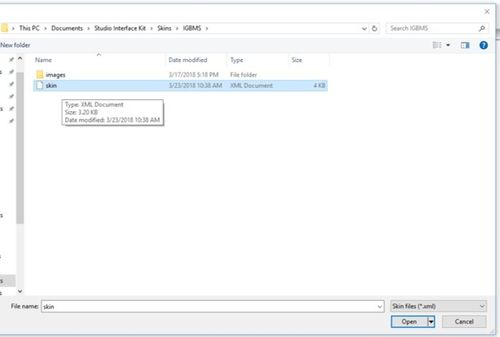
You can manually load skin files within SIK by simply going to File→Open, and selecting the file from it's stored location. See the screenshot below.
A skin file has 4 main areas structured as FontClasses, Images, Sections and Dialogs. The skin file can be viewed and edited by opening them through notepad.
Note: If you choose to manually edit skin files, please take caution since any changes could potentially corrupt them. It is recommended to make a backup copy before performing any edits.
/FontClasses
This contains definitions for global font types that can be assigned to any control label.
/Images
This contains definitions for images that can be assigned to any control picture box.
/Sections
A list of definitions for control labels and picture boxes that are used for the main screen.
/Dialogs
A list of definitions for control labels and picture boxes that are used for multiple screens.
2) Skin Controls
A "skin.xml" file contains a list of controls, which defines the specific behavior of each graphical user interface element that is displayed on the HMI's display screen. There are currently two types of controls available in SIK: Labels and Picture Boxes.
Control - Label
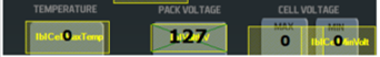
Labels are how text is displayed within SIK. They are highlighted in a yellow mesh.
<CONTROL type="Label" id="lblVoltage" bounds="318;140;170;34" fontclass="LblData" animation="limits" ttonval="" fontstyle="" decimals="none" textenable="True" text="" signal="battery_voltage" digitalin="" />
The following is a list of all available properties users may adjust within a Label.
- Type - Denotes the type of control
- ID - Defines a specific, non-duplicated, name to this type of control
- Bounds - Denotes the location and size of the control
- Fontclass - Sets the label's font type class that will be used by the label
- Text - Text that will appear in the label if not left blank
- Animation - There are currently 2 types of animations available and they are described below:
- None → A static text will appear as defined in the "Text" property
- TellTale → The label will react to the value set in the "ttonval" property
- Decimals - Defines the number of decimal places to display for the data
- Signal - CAN signal that will be displayed by the label
- Digitalin - Digital input that will be used by the label
Control - Picture Box
Picture boxes are how images are shown within SIK. They are highlighted in a green mesh.
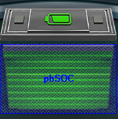
<CONTROL type="PictureBox" id="pbSOC" bounds="324;215;156;62" image="Battery" animation="limits" resolution="Good" ttonval="" maximage="" minimage="" maxlimit="" minlimit="" signal="battery_state_of_charge" digitalin="" />
The following is a list of all available properties users may adjust within a Picture Box.


- MaxImage - Displays this image in the picture box if the max limit is reached and the Animation == "Limits"
- MinImage - Displays this image in the picture box if the min limit is reached and the Animation == "Limits"
- Maxlimit - The maximum set limit to display the image in the "imagemax" property
- Minlimit - The minimum set limit to display the image in the "imagemin" property
.

- Ttonval - Set this value if the Animation == "TellTale"


